TRIM Wines, Signorello Estate
ROLE Brand Strategist, Label Designer, Packaging Designer
HIRED BY Owner
CONTEXT A 44-year-old estate vineyard known for premium wines sought growth in its $12 retail offering.
HIGH LEVEL GOALS 4x sales in the next year
PROJECT GOALS Refresh a ten-year-old wine label and brand story, connecting it to new distributors and customers.
DELIVERABLES
Brand Strategy (overarching story)
Positioning
Tagline
High-Level Messaging
Competitor Analysis
Customer Portrait
Label
Tech Sheet
OUTCOME 2x growth in sales in first month YoY
Brand Strategy Highlights

The ten-year-old label
The Problem
TRIM wasn’t selling as well as the other wines in Signorello Estate’s portfolio.
Room for improvement
We saw room for improvement in three key areas:
An overall brand story could arm the sales team with tools to sell to distributors.
Front label visuals could tell a story that connected with consumers.
Back label could verbally tell a story that connected with consumers.
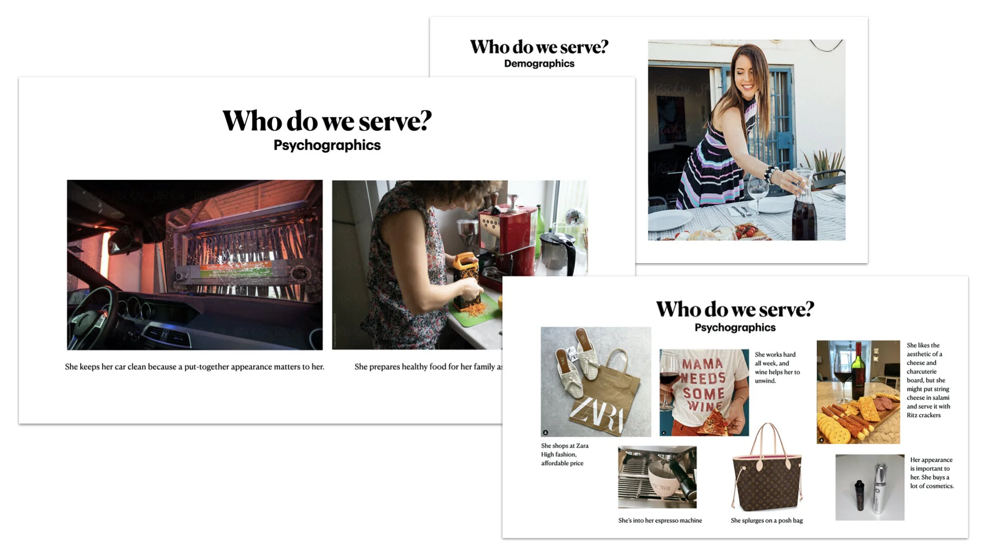
Research
Consumer research showed that the audience:
sought a high-end look.
worked hard and appreciated hard work.
preferred natural or low-additive foods and beverages.
Company research showed:
distributors were confused by and even put off by the name “TRIM.”

Competitor research showed:
TRIM was the only brand in its category that only had 2 wines. Other companies had 10-40 wines in their portfolios.
other brands had empty language describing generic companies, experiences, and tasting notes.

The Challenge
How might we leverage the brand presence TRIM already has to build out a more robust brand story that connects with consumers as well as distributors without disrupting its visual identity?

The Solution
A focused story and a tagline aligned the brand’s name, Trim, with its values and the values of its customers.

The label solution featured foil shears cutting into an embossed grape cluster, subtly changing the original design and adding new dimension of meaning.